Ever Bloom exists to redefine self-care through emotion-driven design. It’s more than cosmetics — it’s a sensory experience built to evoke softness, confidence, and glow. The mission is simple: make people feel beautiful in the most effortless, natural way.
Two weeks ≃ 14 Days. The full brand creation from ideation to final renders was completed in just 14 days.
Scope
Full-scope creative build. Brand Strategy · Naming · Visual Identity · Logo Design · Color System · Packaging Design · 3D Modeling · Rendering · AI Photography · Presentation Curation
Process
1. Concept exploration & moodboard 2. Naming, logo design, and tone system 3. Color & packaging development 4. 3D modeling and rendering 5. AI campaign creation 6. Presentation & curation
Main Elements
Here you can find all the visual elements for this project, as logo design, and the process and thoughts behind it, & also the typography, photography, and colors too.
The wordmark reflects confidence through calmness. We chose a rounded serif typeface with generous spacing and sculpted terminals; a nod to timeless beauty reimagined for a younger, more expressive audience. The logo’s visual rhythm, thick stems contrasted by soft curves, mirrors the brand’s duality: bold yet tender, luxurious yet playful.
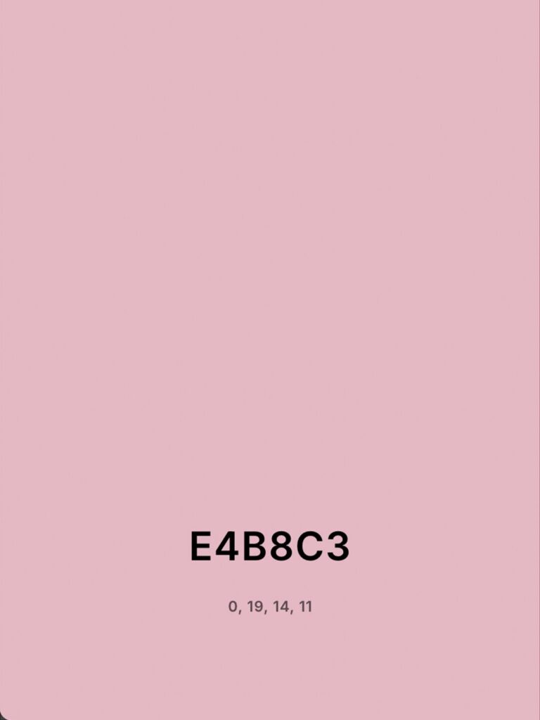
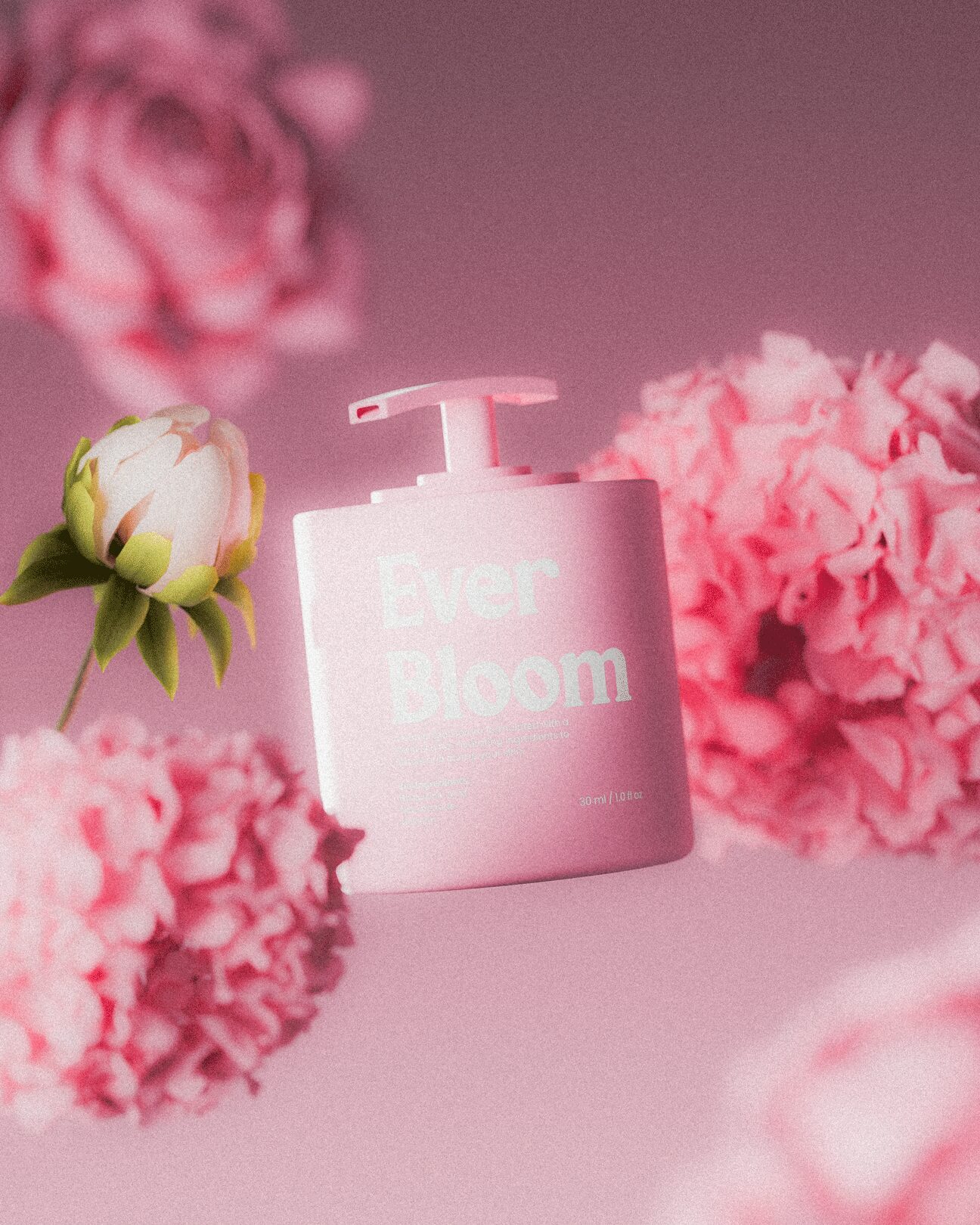
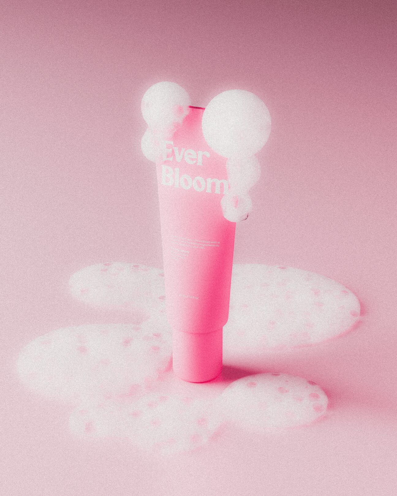
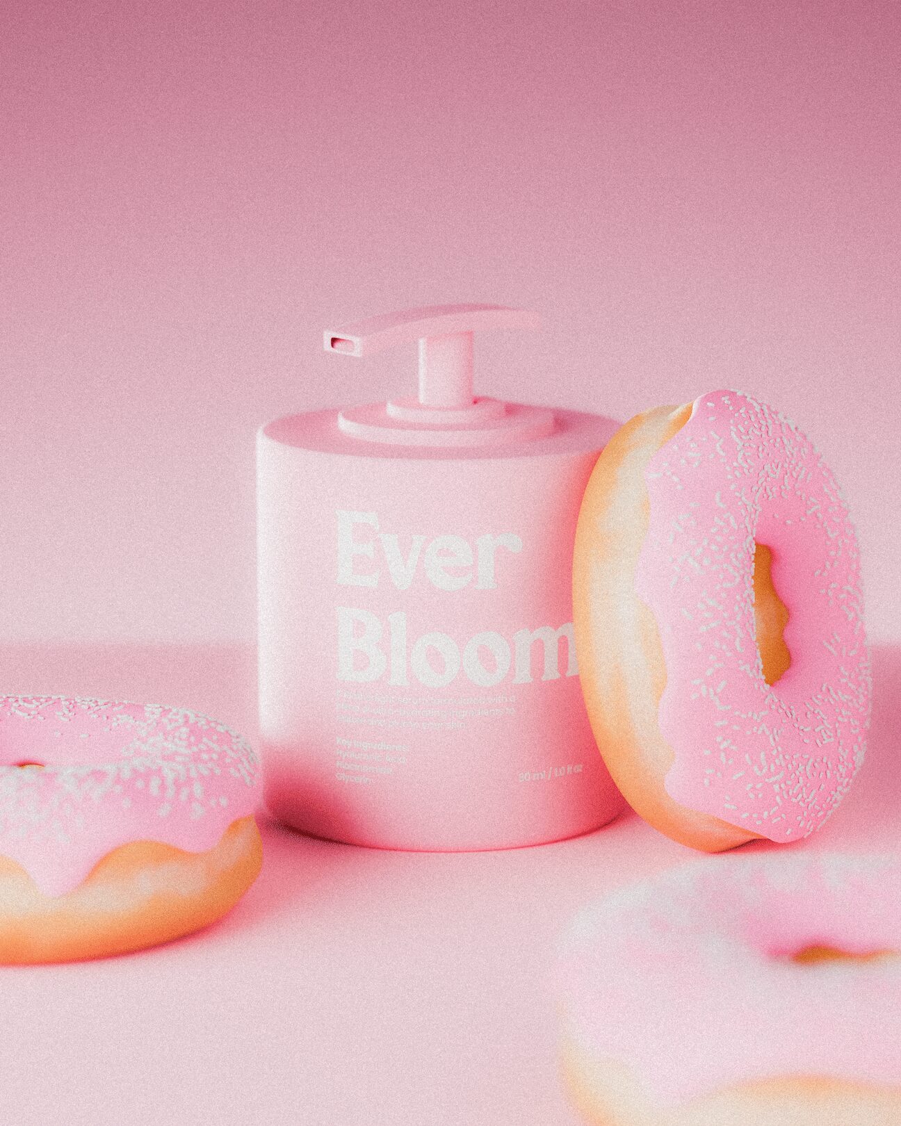
The palette centers on a dreamy, powder-pink hue, paired with pure white as the only accent. Pink symbolizes feminine glow, warmth, and comfort, while white brings purity and calm — together creating a world that feels bright, airy, and emotionally light. This restrained palette allows every product and photo to live within the same soft visual atmosphere — consistent, elegant, and memorable.
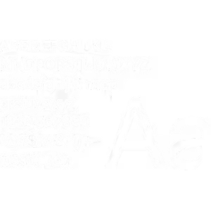
Typography lies at the heart of Ever Bloom’s brand personality — soft yet confident, approachable yet premium. The entire typographic system was designed to visually echo the brand’s essence of “Feminine Glow & Playful Luxury.”
Typographic Voice: Large headlines appear graceful and expressive, while body text remains soft and minimal. The consistent use of generous spacing and delicate hierarchy helps create a calm, breathable visual rhythm — mirroring the brand’s airy and dreamy aesthetic.
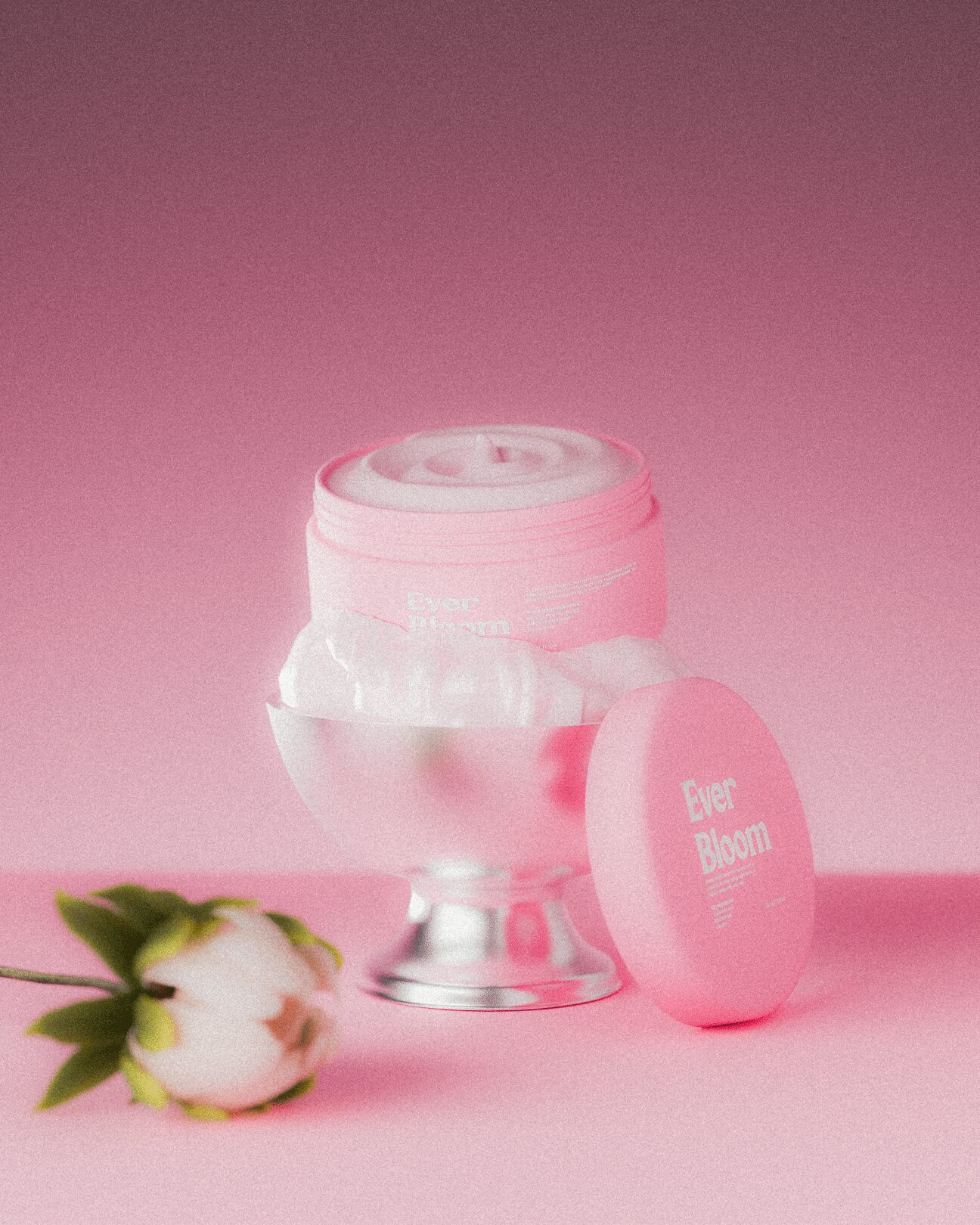
Packaging design became the vessel for translating softness into form. We designed a matte cylindrical pump bottle that feels light, approachable, and collectible. Typography plays the lead role — oversized and unapologetic — contrasted by the calm matte surface that absorbs light rather than reflecting it.
Every angle of the packaging was built to invite touch. The finish is intentionally non-glossy to communicate purity and sensory calmness — a visual and tactile metaphor for Ever Bloom’s philosophy.
All product visualization was executed in Blender, allowing complete control over geometry, light, and texture.
We developed custom shader materials to achieve the perfect matte diffusion, ensuring the light behaves gently across surfaces.
Lighting direction followed the brand’s tone: dreamy and glowy, with a focus on warm, diffused highlights. Every scene was composed as if shot in a conceptual photography studio, with soft edges, pastel backgrounds, and cinematic framing.
The renders bridge reality and imagination, showcasing the product as both an object and an emotion.