Noctavis
A stronger first impression for fine wine.
Fine wine
Art direction & CGI imagery
Website design & development
Campaign figures come from a four-week paid-social comparison of the original product image against the new creative direction. Imagery is from the Noctavis project archive.
The challenge
The bottle had character.
The first impression needed more.
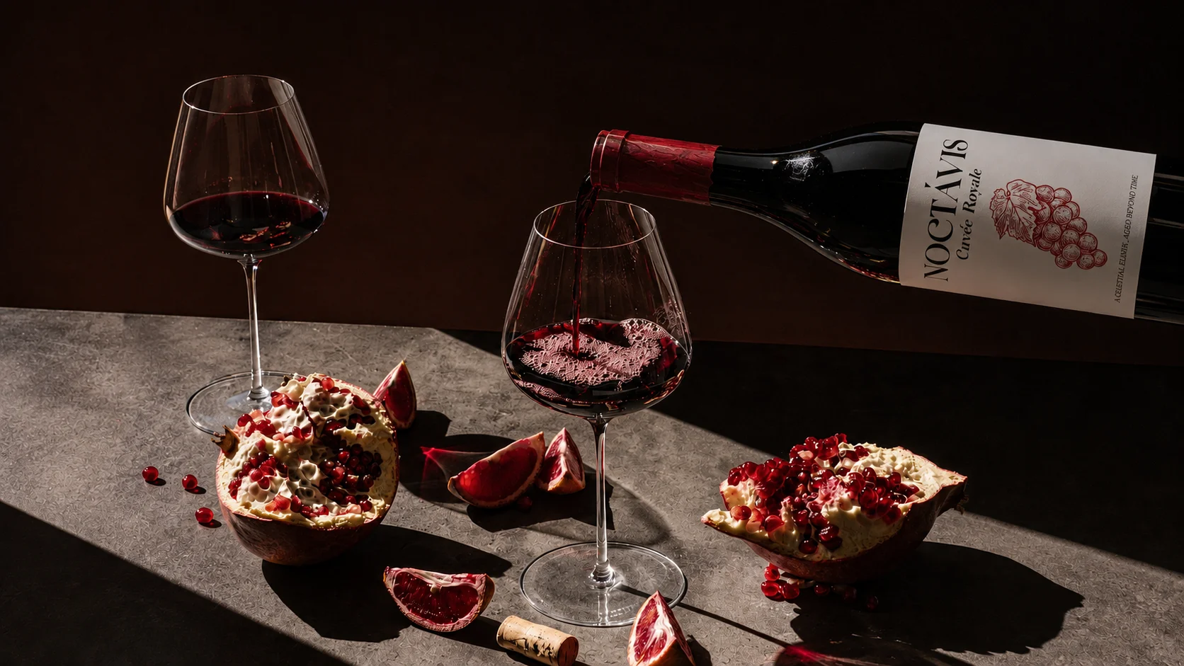
Noctavis is a fine wine brand reaching new customers online. Its product imagery explained what was in the bottle but gave people little reason to remember it.
The label already offered a starting point: a grape illustration, expressive lettering, and a deep red capsule. The challenge was to make those details recognizable across a campaign, while giving the wine a place in people’s lives.
We set a clear creative objective: show the bottle with enough precision to communicate craft, and enough atmosphere to make someone want to open it.
Our approach
Build a world around the bottle.
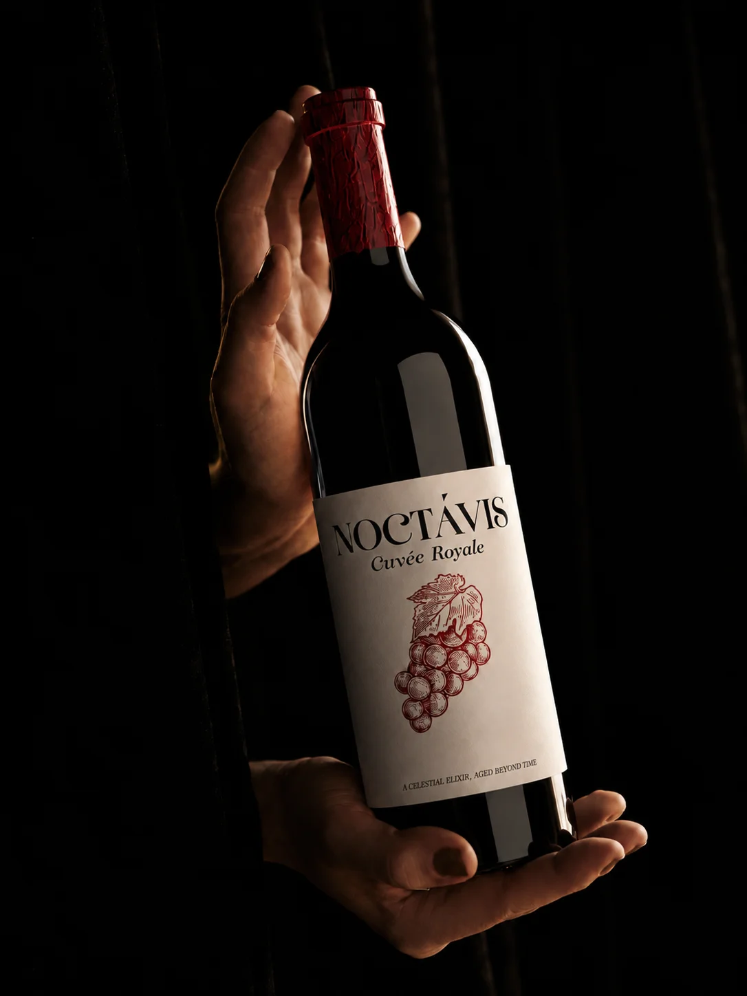
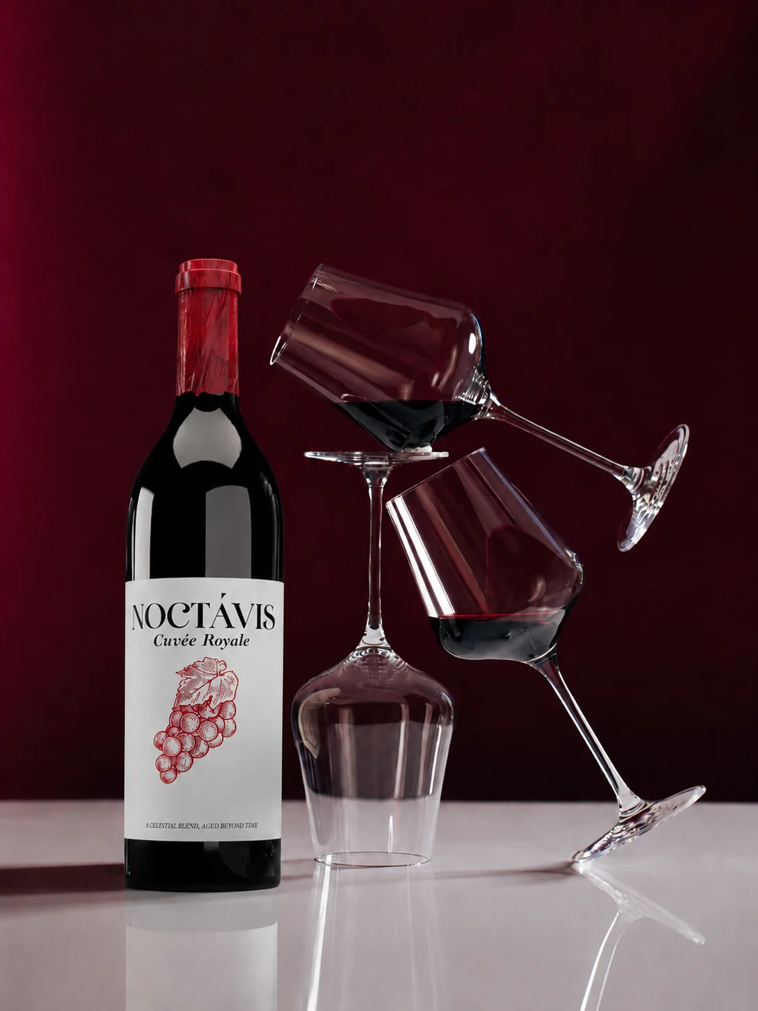
We organized the visual story around three settings: the bottle as an object, the details that give it character, and the moments in which it is shared. Each has a different job, but all lead back to the same product.
Directional light gives the glass definition. Deep reds connect the wine, capsule, and food. Stone, wood, and textured paper bring contrast to the polished bottle. The result is a consistent visual language with room for different compositions.
Make it recognizable
Keep the bottle and label legible. Use sculptural compositions to earn attention without losing the product.
Make it tangible
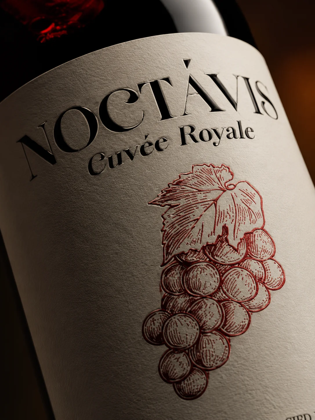
Move closer to the paper, glass, and illustration. Let material detail carry the sense of care.
Make it relatable
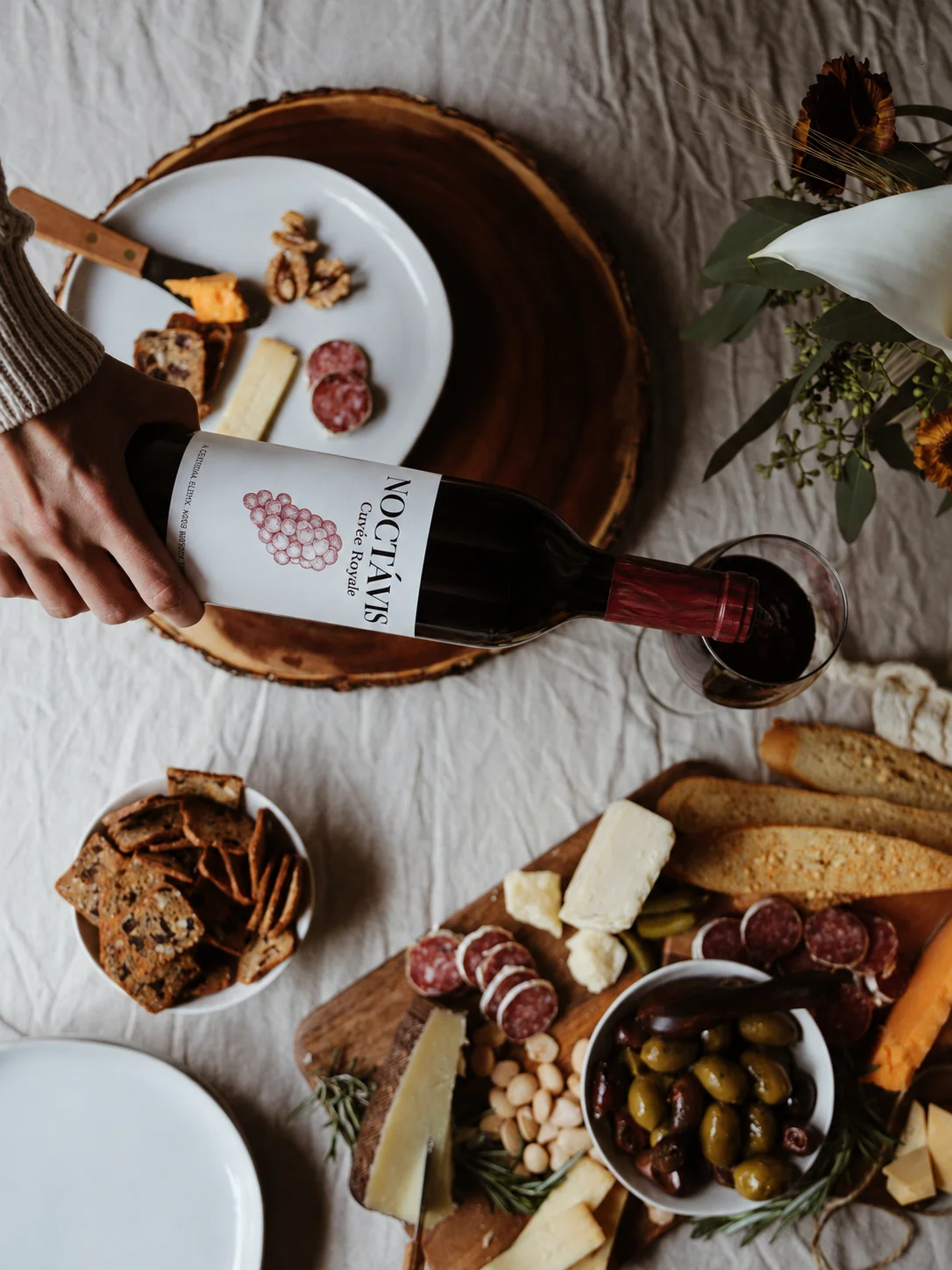
Place the wine at the table, with food and people. Give the imagery a role beyond the product page.
From object to occasion
A place at the table.
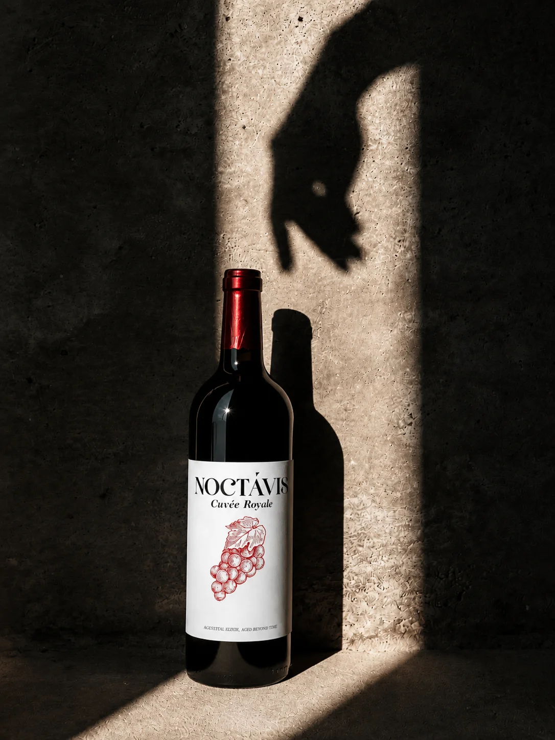
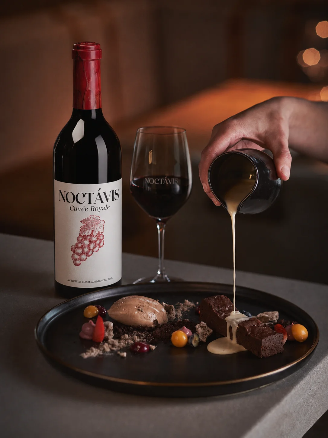
The dining scenes give the brand a warmer register. Food, hands, and the act of pouring turn the bottle into part of an occasion. These images support pairing stories, social campaigns, and the editorial section of the planned website.
The creative outcome
One product.
A 14-image library.
The Noctavis archive holds 14 images. Nine were selected and encoded for web delivery; eight appear across this study, covering three directions: the bottle as an object, the label in detail, and the wine at the table.
Every image keeps the bottle and label recognizable while varying composition and light. That consistency turned a collection of shots into an asset library, ready to carry campaigns, social placements, and the planned website.
Campaign comparison
A four-week paid-social test.
We compared the original product image against the new creative direction over four weeks, with the same audience and placement mix and 120,000 impressions per creative.
| Metric | Baseline | New creative |
|---|---|---|
| Click-through rate | 1.25% | 1.55%24% higher |
| Cost per click | €0.64 | €0.5317% lower |
120,000 impressions per creative produced 1,500 and 1,860 clicks, with implied spend of €960 and €985.80. Audience and placement mix were comparable across both creatives.
Next chapter / Website planned
Carry the same character into the website.
The website is the next phase. The proposed experience opens with the strongest campaign imagery, then moves into the wine, its details, and serving occasions before a clear enquiry or purchase path.
Product information and the sales model still need to be confirmed. Additional CGI shots can then fill specific gaps in the page layouts, rather than adding images without a purpose.
Our approach to websites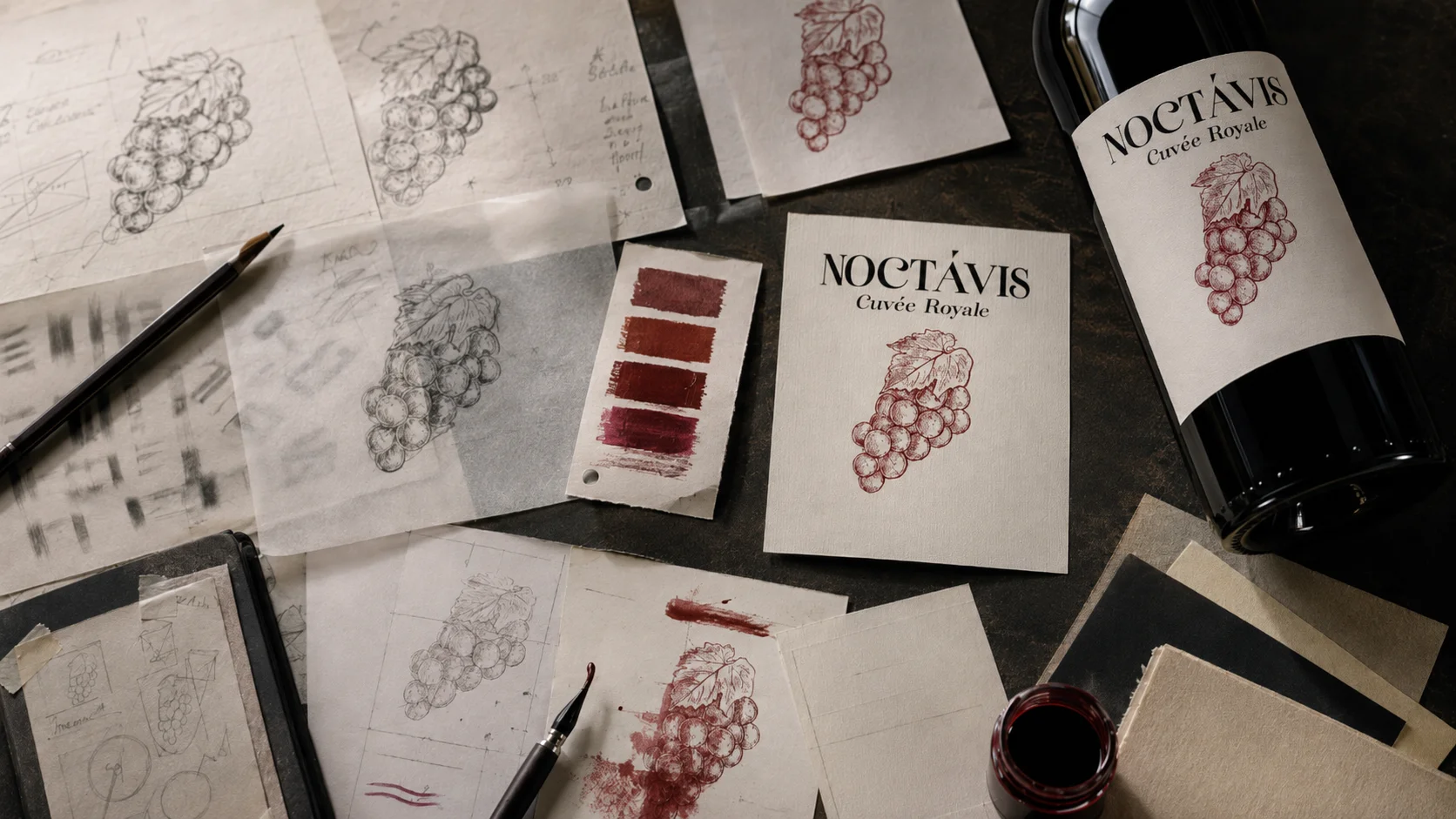
Have a product with a story?